Features
What's Included
Everything you need to build your admin dashboard
160+ HTML Pages
Dashboard variants, UI components, forms, tables, charts, authentication pages, and more.
Multiple Layouts
Vertical sidebar, horizontal navigation, dark mode, RTL support, and box layout options.
SCSS Source Files
Fully customizable SCSS with variables for colors, typography, and component styling.
60+ Plugins
Charts, tables, editors, calendars, maps, notifications, and many more ready-to-use plugins.
Icon Libraries
Font Awesome 7, Themify Icons, IcoFont, Feather Icons, and more icon sets included.
Build Tools
npm-based workflow with development server, SCSS compilation, and production build scripts.
- pages/ -
All HTML pages (160+ template pages)
- index.html - Main dashboard page
- dashboard-*.html - Dashboard variants (ecommerce, analytics, CRM, project)
- auth-*.html - Authentication pages (login, register, reset password)
- ...more - UI components, forms, tables, charts, and application pages
- assets/ -
Compiled CSS, JavaScript, images, and icons
- css/ - Additional CSS files and theme/ subfolder with compiled SCSS
- js/ - Core JavaScript (pcoded.min.js, vartical-layout.js, horizontal-layout.js)
- pages/ - Page-specific JavaScript for charts, editors, tables, etc.
- images/ - Template images, avatars, and backgrounds
- icon/ - Icon font CSS and font files
- fonts/ - Web fonts used in the template
- scss/ -
SASS source files for customization
- style.scss - Main entry point for vertical layout
- pcoded-horizontal.scss - Entry point for horizontal layout
- partials/ - Variables, mixins, components, and theme elements
- plugins/ -
Third-party libraries (auto-generated from npm)
- bootstrap/ - Bootstrap 5.3 framework
- jquery/ - jQuery 4.0.0
- chart.js/ - Chart.js for data visualization
- datatables.net/ - DataTables for advanced tables
- ...more - 60+ additional plugins
- extra-pages/ - Standalone pages (404, coming soon, email templates, landing page)
- build/ -
Build scripts and configuration
- build-prod.js - Production build script
- npm/ - Plugin copy configuration
- config/ - PostCSS and build configuration
- docs/ - Documentation files (this documentation)
- index.html - Root redirect to pages/index.html
- package.json - npm dependencies and scripts
Page Layout Structure
Understanding the HTML structure of Adminty pages
Adminty uses a consistent page structure across all templates. The layout consists of a navigation sidebar, header, and main content area. You can choose between vertical sidebar (default) or horizontal navigation layouts.
Available Layout Options
| Layout Type | Description | Configuration |
|---|---|---|
| Vertical Sidebar | Default layout with collapsible sidebar navigation | Uses vartical-layout.js |
| Horizontal Nav | Top navigation bar with dropdown menus | Uses horizontal-layout.js and pcoded-horizontal.css |
| Dark Mode | Dark theme variant for reduced eye strain | Toggle via theme settings or add dark class |
| RTL Layout | Right-to-left text direction support | Use style.rtl.css instead of style.css |
| Box Layout | Centered container with fixed max-width | See box-layout.html example |
Basic Page Structure
<!DOCTYPE html>
<html lang="en">
<head>
    <!-- Meta tags, title, CSS files -->
    <link rel="stylesheet" href="plugins/bootstrap/dist/css/bootstrap.min.css">
    <link rel="stylesheet" href="../assets/css/theme/style.css">
</head>
<body>
    <!-- Pre-loader (optional) -->
    <div class="loader-bg">...</div>

    <!-- Menu sidebar -->
    <nav class="pcoded-navbar">
        <!-- Logo, navigation items -->
    </nav>

    <!-- Header + Main Content -->
    <div class="pcoded-main-container">
        <div class="pcoded-wrapper">
            <!-- Top header bar -->
            <nav class="pcoded-header">...</nav>

            <!-- Page content -->
            <div class="pcoded-content">
                <div class="pcoded-inner-content">
                    <div class="main-body">
                        <div class="page-wrapper">
                            <!-- Your content here -->
                        </div>
                    </div>
                </div>
            </div>
        </div>
    </div>

    <!-- Scripts -->
    <script src="plugins/jquery/dist/jquery.min.js"></script>
    <script src="plugins/bootstrap/dist/js/bootstrap.bundle.min.js"></script>
    <script src="../assets/js/pcoded.min.js"></script>
    <script src="../assets/js/vartical-layout.js"></script>
</body>
</html>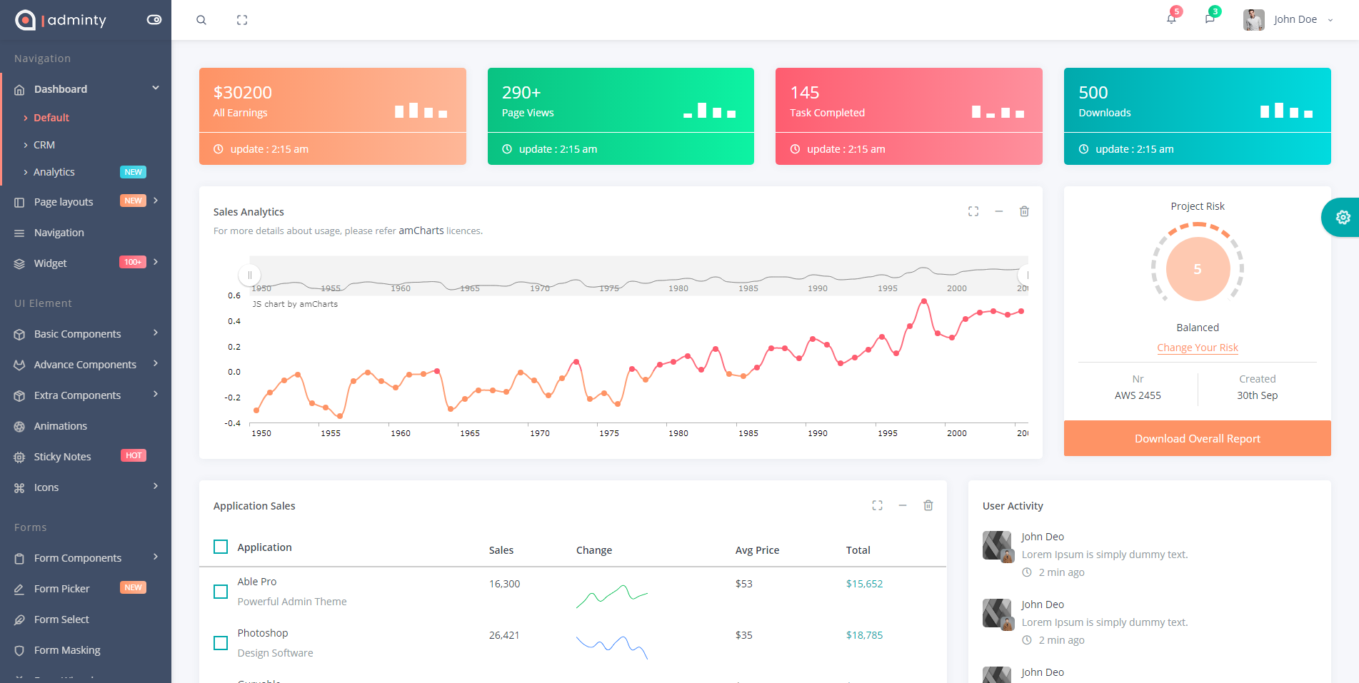
npm Installation
Prerequisites
Make sure you have Node.js installed (v18 or higher recommended).
Install Dependencies
npm installDevelopment Server
Start the development server with live reload and SCSS watching:
npm run devBuild for Development
Compile CSS and copy plugin files:
npm run buildProduction Build
Create an optimized dist/ folder for deployment with only necessary files:
npm run build:prodCompile SCSS Only
Compile SCSS files to CSS without starting the dev server:
npm run cssAll Available Commands
| Command | Description |
|---|---|
npm install |
Install all dependencies |
npm run dev |
Start development server with browser-sync and SCSS watcher |
npm run build |
Compile CSS and copy plugins for development |
npm run build:prod |
Create optimized production build in dist/ folder |
npm run css |
Compile SCSS to CSS (includes prefixing, RTL, and minification) |
npm run plugins |
Copy plugin files from node_modules to plugins/ folder |
SCSS Customization
SCSS Directory Structure
All SCSS source files are located in the scss/ folder:
scss/
├── style.scss                    # Main entry point
├── pcoded-horizontal.scss        # Horizontal layout variant
└── partials/
    ├── _variables.scss           # Theme colors and configuration
    ├── _mixins.scss              # Reusable SASS mixins
    ├── _general.scss             # Base styles
    ├── _generic.scss             # Utility classes
    ├── _dark.scss                # Dark theme overrides
    ├── menu/                     # Navigation menu styles
    ├── theme-elements/           # Buttons, forms, icons, shadows
    └── other/                    # Feature-specific styles (charts, chat, calendar, etc.)
Theme Color Variables
Customize the theme colors in scss/partials/_variables.scss:
// Primary Colors
$primary-color: #01a9ac;
$warning-color: #fe9365;
$danger-color: #fe5d70;
$success-color: #0ac282;
$info-color: #2DCEE3;
$inverse-color: #404E67;

// Background Colors
$body-bg: #f6f7fb;
$card-bg: #fff;

// Typography
$font-family: 'Open Sans', sans-serif;
Compiling SCSS
After making changes to SCSS files, compile them using:
# Compile once
npm run css

# Watch for changes during development
npm run dev
CSS Output Files
SCSS compiles to assets/css/theme/ with the following variants:
| File | Description |
|---|---|
style.css |
Main theme stylesheet (unminified) |
style.min.css |
Minified version for production |
style.rtl.css |
Right-to-left language support |
style.rtl.min.css |
Minified RTL version |
pcoded-horizontal.css |
Horizontal navigation layout |
CSS Classes Reference
Adminty uses Bootstrap 5's utility classes. Here are the most commonly used responsive display utilities:
Bootstrap 5 Display Utilities
| Class |
XS <576px |
SM ≥576px |
MD ≥768px |
LG ≥992px |
XL ≥1200px |
XXL ≥1400px |
|---|---|---|---|---|---|---|
.d-none |
Hidden | Hidden | Hidden | Hidden | Hidden | Hidden |
.d-sm-none |
Visible | Hidden | Hidden | Hidden | Hidden | Hidden |
.d-md-none |
Visible | Visible | Hidden | Hidden | Hidden | Hidden |
.d-lg-none |
Visible | Visible | Visible | Hidden | Hidden | Hidden |
.d-none .d-md-block |
Hidden | Hidden | Visible | Visible | Visible | Visible |
.d-md-none .d-lg-block |
Visible | Visible | Hidden | Visible | Visible | Visible |
Adminty Custom Classes
| Class | Description |
|---|---|
.pcoded-navbar |
Main sidebar navigation container |
.pcoded-header |
Top header bar |
.pcoded-content |
Main content area wrapper |
.card |
Bootstrap card component (used extensively) |
.bg-c-* |
Background color utilities (e.g., .bg-c-blue, .bg-c-green) |
.text-c-* |
Text color utilities (e.g., .text-c-blue, .text-c-green) |
.b-* |
Border utilities (e.g., .b-l-primary for left border) |
Plugins
Core Dependencies
The following are the core libraries and their versions used in Adminty:
| Package | Version | Description |
|---|---|---|
| Bootstrap | 5.3.8 | CSS framework |
| jQuery | 4.0.0 | JavaScript library |
| Font Awesome | 7.1.0 | Icon library |
| Chart.js | 4.5.1 | Charting library |
| DataTables | 2.3.7 | Advanced tables |
| FullCalendar | 6.1.20 | Calendar component |
| SweetAlert2 | 11.26.18 | Beautiful alerts |
| Select2 | 4.1.0 | Enhanced select boxes |
| Swiper | 12.1.0 | Touch slider |
| Intro.js | 8.3.2 | Step-by-step guides |
Plugin Usage Reference
Below is a reference table of all plugins installed via npm (package.json). These are copied to plugins/ folder via npm run plugins.
| Plugin Name | npm Package | Version | Documentation |
|---|---|---|---|
| Animate.css | animate.css | ^4.1.1 | View Docs |
| Bootstrap | bootstrap | ^5.3.8 | View Docs |
| Bootstrap Datepicker | bootstrap-datepicker | ^1.10.1 | View Docs |
| Bootstrap Daterangepicker | bootstrap-daterangepicker | ^3.1.0 | View Docs |
| Bootstrap Maxlength | bootstrap-maxlength | ^2.0.0 | View Docs |
| Bootstrap Multiselect | bootstrap-multiselect | ^2.0.0 | View Docs |
| Bootstrap Slider | bootstrap-slider | ^11.0.2 | View Docs |
| Chart.js | chart.js | ^4.5.1 | View Docs |
| Chartist | chartist | ^1.5.0 | View Docs |
| Cropper.js | cropperjs | ^1.6.2 | View Docs |
| D3.js | d3 | ^7.9.0 | View Docs |
| DataTables | datatables.net-bs5 | ^2.3.7 | View Docs |
| Feather Icons | feather-icons | ^4.29.2 | View Docs |
| Font Awesome | @fortawesome/fontawesome-free | ^7.1.0 | View Docs |
| FullCalendar | @fullcalendar/core | ^6.1.20 | View Docs |
| GLightbox | glightbox | ^3.3.1 | View Docs |
| Handsontable | handsontable | ^16.2.0 | View Docs |
| i18next | i18next | ^25.8.4 | View Docs |
| Intro.js | intro.js | ^8.3.2 | View Docs |
| jQuery | jquery | ^4.0.0 | View Docs |
| jQuery Bar Rating | jquery-bar-rating | ^1.2.2 | View Docs |
| jQuery Countdown | jquery-countdown | ^2.2.0 | View Docs |
| jQuery Minicolors | jquery-minicolors | ^2.1.10 | View Docs |
| jQuery SlimScroll | jquery-slimscroll | ^1.3.8 | View Docs |
| jQuery Steps | jquery.steps | ^1.1.4 | View Docs |
| jQuery UI | jquery-ui | ^1.14.2 | View Docs |
| jQuery Validation | jquery-validation | ^1.22.0 | View Docs |
| jsColor | @eastdesire/jscolor | ^2.5.2 | View Docs |
| jsTree | jstree | ^3.3.17 | View Docs |
| LightGallery | lightgallery | ^2.9.0 | View Docs |
| Moment.js | moment | ^2.30.1 | View Docs |
| PNotify | pnotify | ^3.2.1 | View Docs |
| Select2 | select2 | ^4.1.0-rc.0 | View Docs |
| SortableJS | sortablejs | ^1.15.6 | View Docs |
| Spectrum Colorpicker | spectrum-colorpicker2 | ^2.0.10 | View Docs |
| SweetAlert2 | sweetalert2 | ^11.26.18 | View Docs |
| Swiper | swiper | ^12.1.0 | View Docs |
| Switchery | switchery | ^0.0.2 | View Docs |
| Typeahead.js | typeahead.js | ^0.11.1 | View Docs |
Creating New Pages
How to create new pages in the template
Follow these steps to create a new page that integrates with the existing navigation and styling:
Step 1: Copy an Existing Page
Start by copying an existing page that's similar to what you want to create. A good starting point is pages/index.html or any basic page like pages/bs-basic-table.html.
Step 2: Update the Page Title and Breadcrumb
<!-- Update the page title -->
<title>Your Page Title | Adminty</title>

<!-- Update the breadcrumb -->
<div class="page-header">
    <div class="page-block">
        <div class="row align-items-center">
            <div class="col-md-12">
                <div class="page-header-title">
                    <h5 class="m-b-10">Your Page Title</h5>
                </div>
                <ul class="breadcrumb">
                    <li class="breadcrumb-item"><a href="index.html">Home</a></li>
                    <li class="breadcrumb-item"><a href="#">Category</a></li>
                    <li class="breadcrumb-item active">Your Page</li>
                </ul>
            </div>
        </div>
    </div>
</div>
Step 3: Add Your Content
Add your content inside the .page-wrapper div. Use Bootstrap's card component for consistent styling:
<div class="card">
    <div class="card-header">
        <h5>Card Title</h5>
    </div>
    <div class="card-body">
        <!-- Your content here -->
    </div>
</div>
Step 4: Add to Navigation Menu
To add your new page to the sidebar navigation, edit the navigation section in your page's HTML. Find the .pcoded-navbar section and add a new menu item:
<li class="pc-item">
    <a href="your-page.html" class="pc-link">
        <span class="pc-micon"><i class="ti-home"></i></span>
        <span class="pc-mtext">Your Page</span>
    </a>
</li>
Tip
If you need to update the menu across all pages, consider using a build tool or templating system. The menu HTML is repeated in each page for simplicity.
Adding New Plugins
How to add third-party plugins to the template
Method 1: Using npm (Recommended)
The recommended way to add new plugins is through npm:
# 1. Install the package
npm install package-name --save

# 2. Add to plugins-list.js (build/npm/plugins-list.js)
# 3. Run the plugins script
npm run plugins
Step 2: Update plugins-list.js
Open build/npm/plugins-list.js and add an entry for your new plugin:
module.exports = {
    // ... existing plugins
    'package-name': [
        'dist/package-name.min.js',
        'dist/package-name.min.css'
    ]
};
Step 3: Include in Your Page
After running npm run plugins, include the plugin files in your HTML:
<!-- CSS in head -->
<link rel="stylesheet" href="plugins/package-name/dist/package-name.min.css">

<!-- JS before closing body -->
<script src="plugins/package-name/dist/package-name.min.js"></script>
Method 2: Manual Installation
For plugins not available on npm, you can manually add them:
- Create a folder in
plugins/with the plugin name - Copy the plugin's CSS and JS files into the folder
- Reference the files in your HTML pages
Important
When adding plugins manually, make sure to check for jQuery compatibility and Bootstrap 5 compatibility. Some older plugins may require updates or alternatives.
Browser support
We support the latest versions of all modern browsers. Internet Explorer is no longer supported. Use Microsoft Edge or another modern browser for the best experience.
-
Chrome
-
Safari
-
Opera
-
FireFox
-
Edge
FAQ
Begin typing your question. If we don't have an answer for it in our FAQ, please leave us a message on our contact page.
-
What is Adminty?
Adminty is a responsive admin template/dashboard built with Bootstrap 5.3. It's useful for complete projects like CRM systems, Task Management, User Management, Social Dashboards, and more. It comes with tons of ready-made plugins and components to help you at every step. -
Why choose Adminty?
Adminty is built using Bootstrap 5.3 and jQuery 4.0. It includes 100+ pages, 50+ plugins, multiple layout options, dark mode support, RTL support, and is fully responsive across all devices. -
How do I install Adminty?
Installation is simple: 1) Extract the downloaded zip file, 2) Runnpm installto install dependencies, 3) Runnpm run devto start the development server with live reload. The browser will automatically open with the template. -
How do I customize colors and themes?
All theme colors are defined inscss/partials/_variables.scss. Simply modify the color variables (like$primary-color,$success-color, etc.) and runnpm run cssto compile your changes. -
How do I create a production build?
Runnpm run build:prodto create an optimized production build. This creates adist/folder containing only the files needed for deployment, with minified CSS and optimized assets. -
Does Adminty support RTL languages?
Yes! Adminty includes full RTL (Right-to-Left) support. RTL stylesheets are automatically generated during the build process. Usestyle.rtl.cssinstead ofstyle.cssfor RTL layouts. -
What browsers are supported?
Adminty supports all modern browsers including Chrome, Firefox, Safari, Edge, and Opera. Internet Explorer is not supported as it has been discontinued by Microsoft. -
How do I add a new plugin?
1) Add the npm package topackage.json, 2) Add a mapping inbuild/npm/plugins-list.js, 3) Runnpm install && npm run plugins, 4) Reference the plugin from theplugins/directory in your HTML. -
What about License terms?
Adminty comes with a single license for each purchase. If you need to use Adminty for multiple projects, you'll need to purchase additional licenses. -
What support is included?
6 months of support is included with every purchase. Our team responds to support tickets within 24 hours. Extended support options are also available.
Version Change Log
See full changelog for detailed version history.
Current Version: 3.3.0
- Upgraded to jQuery 4.0 with compatibility layer
- Handsontable upgraded to v16.2.0
- Dependencies updated (DataTables, FullCalendar, SweetAlert2, Swiper, LightGallery, and more)
- Sidebar menu badges (NEW/HOT)
- Docs build script (
npm run build:docs)
v3.2.0
Production build script, updated demo dates, browser SVG logos, bug fixes
v3.1.0
Reorganized sidebar menu, menu update script, AVIF image support
v3.0.0
Major upgrade: Bootstrap 5, Font Awesome 7, Chart.js 4, modern npm build system
v2.0.0
Bootstrap 5 migration, npm package management, SCSS pipeline
v1.0.0
Initial release with Bootstrap 4